I've worked solo and with my team for over 17 years, working on more than 600 websites and brand identity projects for creative shop owners. I also often review websites for businesses earlier on their path — in person, online, and by email. I've seen a lot of websites! Here are a few things that I know from experience will improve how your site performs for you.
1. Make it clear what you sell
You might be quite surprised how many times I visit a website where I see something, maybe a photo of artwork, and still don't understand what the website is about. Is this artwork for sale? Originals or prints? Or is this just a portfolio? Can I buy it on a greeting card? Explain what you do instantly with a photo and a line or two of text. Someone who is only going to glance at your site for a moment should immediately get it.
2. Make it clear who it's for
The best way to sell your products online is to know exactly who your ideal customer is, because then you can speak directly to them, explaining benefits and features that are important to them and why, and connecting via your shared values. When I first land on a new website, I try to figure out if it's for me or not, and will move away quickly if I don't feel like I'm in the right place.
3. Share what makes your business different
It's important to know why your customer would choose you over your closest competitors. If you don’t know, it's going to be impossible to communicate that to them. Get clear on the few things that, when combined, make you meaningfully different. Your story is what makes you stand out among the crowd, and if you communicate this well, your customers will fall in love with your brand.
4. Choose the one main thing you want people to do
When I'm on a poorly designed website, I often can't tell what the shop owner wants me to do. Sometimes there are three or four big actions I can take from the home page, and sometimes there doesn't seem to be any action to take. Figure out what you would want your new customer to do on your site, if they only did one thing, and make it easy and obvious how to do that.
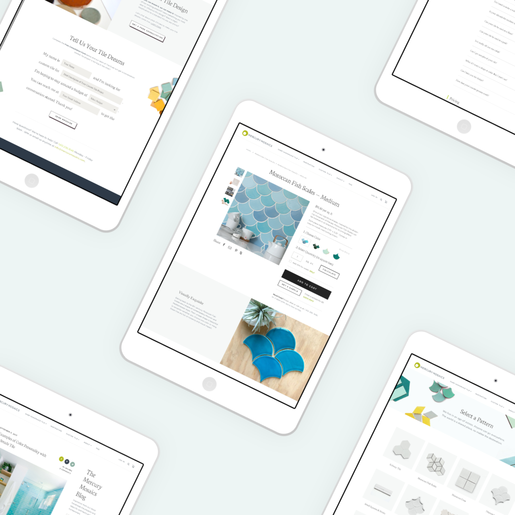
5. Take great photos
Photography is a huge big deal. You want your photos to be beautiful, clear, compelling and consistent (same size, dimensions and style), or it looks like a garage sale on your site. I strongly recommend you use two types of product photos: lifestyle photos and white background ones. Be sure that some of the photos show your product in use, and make it look irresistible. You may want to include video, if it helps explain your product.
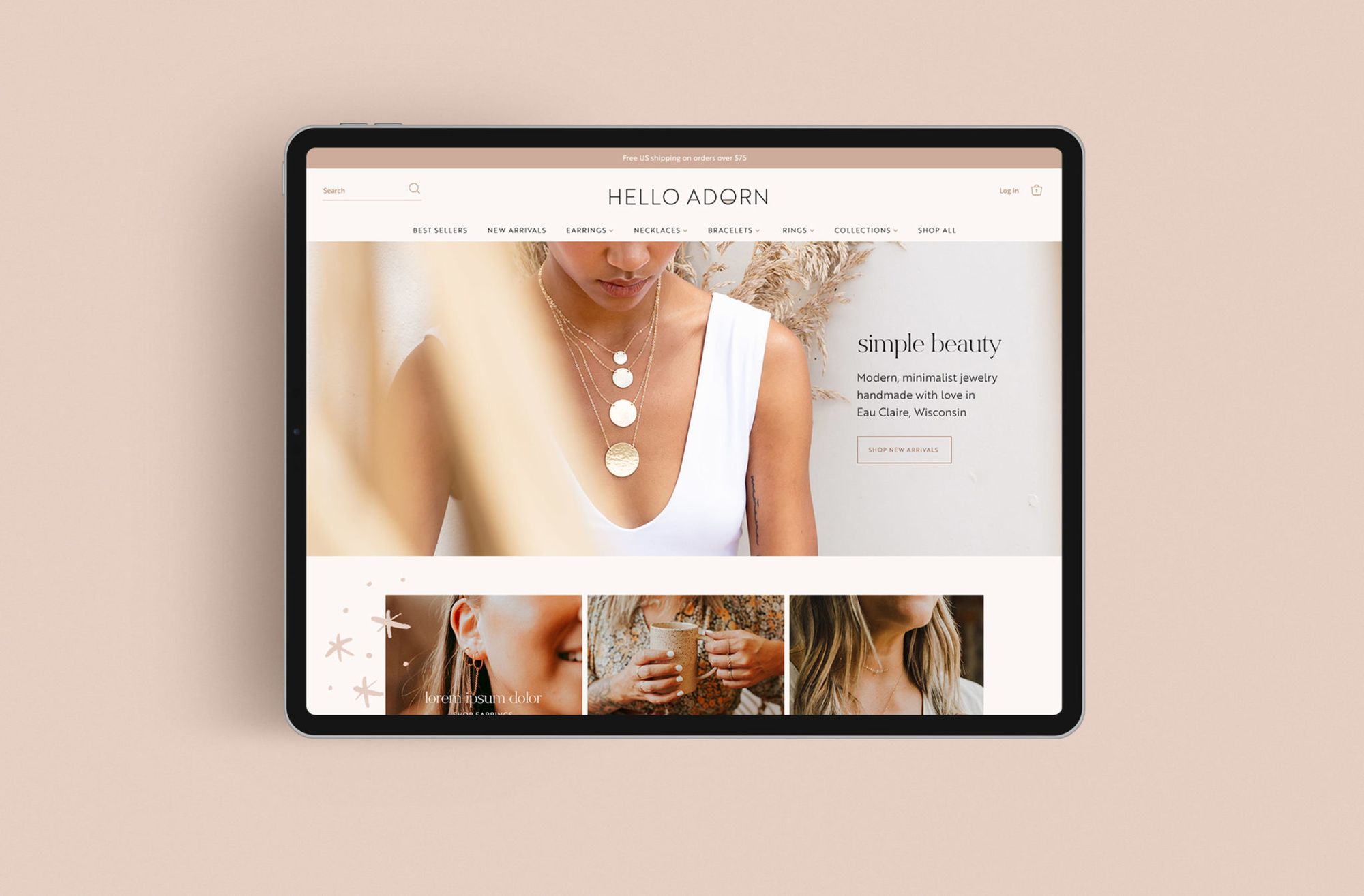
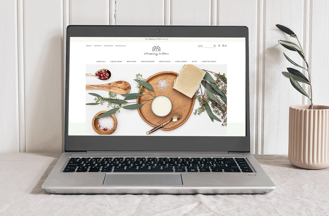
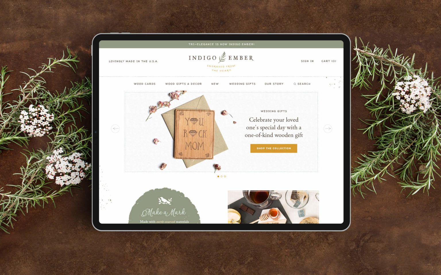
6. Prioritize your header navigation
You need to guide your customers through your site. The first few links in your header navigation should be the most important places you want visitors to go. Usually, for an e-commerce site, these are shop categories. You don’t need to have your press page and terms and conditions and whatnot all up top. The most important things should be up top, and the rest can be organized neatly in the footer. You don't need a "home" link — the logo can link to your homepage. For designer and artisan businesses, we put the main shop categories in a row, with the About page at the end.
7. Reviews and testimonials bring the power of social proof
If it’s a customer’s first time buying something from you, they might have fears or hesitations that hold them back from making a purchase. Reviews, testimonials and guarantees are great ways to use social proof to improve your chances of converting website visitors into customers.
8. Social media links can go to the bottom
I see a lot of websites with social media links right up top in the header. The way we see it, you’d probably rather people start shopping with you, than send them to wander off to the most distracting sites on the internet, right? You can put your social media links in the footer, for people who’ve already looked through your site, or are purposefully looking for these links.
9. Use calls to action
You need to tell your customers what to do on your site. So make sure each page has a call to action (often a button to click) that guides them on the path to make a purchase. Even a page like your About page can list your favourite picks from your shop, or some other relevant way to get people back to shopping.
10. Get some traffic
All this website improvement won't do you any good if you aren't getting much traffic to your site. So make sure you also spend time developing a customer base and spreading the word about what you do. I’ve put together a guide to the 10 things to do to make your business work online, including both traffic-generating and website-improving tips. You can download that for free on my website.
Arianne Foulks is a popular educator and small business enthusiast. As a champion for creative brands, she has a 17+ year reputation for thoughtful redesigns that help businesses level up.
At Aeolidia, her web and graphic design agency, she works exclusively with brands with a penchant for design, and has launched hundreds of online shops. She loves having a problem to solve, and has focused throughout her career on building online homes for fascinating people.