On April 28, makers, creative business owners and Workshop members gathered virtually with e-commerce expert Arianne Foulks. The owner of web and graphic design agency Aeolidia, Foulks did a live review of several websites and offered her best tips to improve them for more sales and more sign-ups.
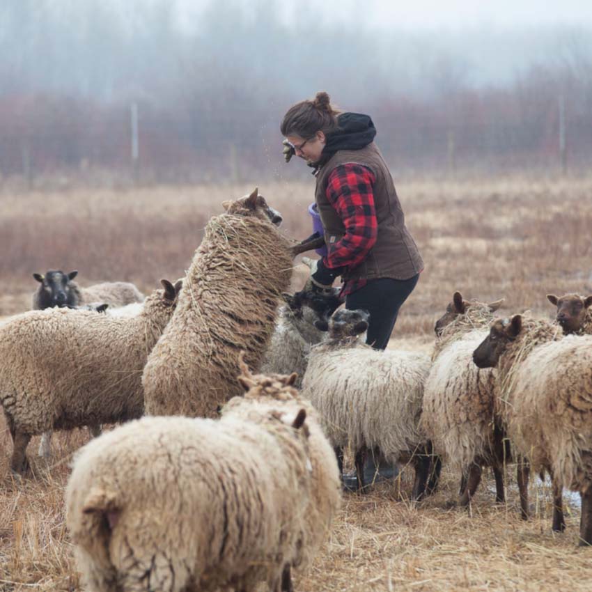
Three Workshop members gamely volunteered to have their websites reviewed live by Foulks: Vanessa Lamarche of Boreal Blues, Cheryl Rutherford of EncoreWrap, and Jonika Griffin of Rest Simple. Foulks also shared two websites that her agency designed.
📽️
Workshop members can watch the full event replay below!
During the event, Foulks reiterated and expanded upon some of the tips that she shared in the article she wrote for Workshop, “10 Achievable Website Improvements That Will Pay Off,” and also dished out some fresh ideas on how to get your website to sell more. Here are a few of our favourite gems from the event.
On getting more newsletter signups
Foulks kicked off her website reviews by looking at Lamarche’s online shop for Boreal Blues. The first thing Foulks noticed was the site’s pop-up window, which invites visitors to sign up for the Boreal Blues newsletter. “That's a good way to get people's attention,” said Foulks, “But if you’re able to put it on a delay, that can be better, because then people know if they care.” If your pop-up appears as soon as someone lands on your site, it doesn’t give them a chance to see what your site is about, so how would they know yet whether they want to be on your newsletter list? Most software allows you to set a delay for a number of seconds or after someone scrolls down a bit, or based on “exit intent,” when your cursor starts heading to the Back Button.
Foulks also suggested that Lamarche change the text of her pop-up to something more enticing so that it would draw in more newsletter signups. “People have so much email in their inbox, they don't really want more unless it's irresistible,” she said. For example, one of Aeolidia’s clients — natural apothecary line Whispering Willow — offers newsletter subscribers a free lip balm with their next order. “It’s well worth your time to spend an entire day just sitting and thinking about ‘How can I get people to want to join my email newsletter?’”
One type of offer to be wary of: discounts. During her review of the Rest Simple site, Foulks talked about the potential dangers of enticing newsletter signups with a discount. “If the first way somebody shops from you is with a discount, they might expect to keep shopping from you like that.” If you can, try to think of a different type of offer that will lure people into signing up. To get you started, Foulks shares some advice on her website about how to convert visitors to newsletter subscribers.
On using your announcement bar wisely
Three times during the event, the topic of announcements bars came up. This short snippet of text across the top of your site is valuable real estate and Foulks suggested that it’s a great place to advertise an offer. “The one that works best is to have free shipping over a certain amount spent.” To choose what that amount should be, she suggested looking at your current average order value and setting the free shipping threshold at 10 to 25 percent over that. For example, if your average order is $100, offer free shipping on orders over $120. “Then maybe you can talk people into sticking an extra little thing in their cart.” Yay, more sales!
And about that bar: “If you have an announcement bar and no particular announcements going on, it's okay to just to turn that off and not distract people from shopping,” said Foulks.
On the importance of a legible logo
On two sites that Foulks reviewed, she noticed that the taglines in the logos were difficult to read because they showed up so small. Her recommendation: Create a simpler version of your logo that can be used for your website and other places where it will be small. “Save the tagline for a different place and just have the logo,” Foulks said. Your logo may show up small in some shop themes or on mobile, so it’s a good idea to use a simplified logo that’s clear and easy to read on your site.
“When we design brand identities [at Aeolidia], we usually have a couple of different options,” explained Foulks, who said that they’ll sometimes make three versions of one logo — a circle or square logo, a horizontal version and a vertical version.
If your logo is difficult to understand when it’s small, it’s easy for site visitors to forget your shop name. “And then that's a tragedy if later, I'm like, ‘Where were those cool pillows?’ and I don't remember the name.”
On cookie consent
The second site that Foulks reviewed, Rutherford’s EncoreWrap, had a notification banner to accept web cookies, a requirement of the General Data Protection Regulation (GDPR) in Europe. But it’s not a requirement elsewhere, including in Canada, so if your software allows it, Foulks said to set it to show only for visitors from the European Union. “Then every person who shows up from Washington State or Toronto or wherever, doesn't have to bother with the cookie banner,” said Foulks.
On educating your buyers
Also during her review of the EncoreWrap site, Foulks noticed that a large portion of the site was dedicated to teaching customers about the product, which is an eco-friendly alternative to disposable gift wrap. If you likewise have an unusual product, something that might require you to teach your buyers something about it, you might be tempted to put the emphasis on education with content like how-to instructions and Why Buy pages.
But there’s no need to put that education component front and centre. “Most people aren't coming here ready to go into a research project,” said Foulks. “Instead, they’re going to want to have that info sprinkled delightfully throughout the site, so they learn it without trying to.” In part, this includes communicating the benefits of the product to buyers and adding usage ideas in places like product pages.
On choosing a website theme for your online shop
In the question period at the end of the event, one maker asked for tips on how to choose a website theme. Foulks’s key piece of advice: start by looking at your content and what you sell. “Some themes might be great for someone else, but not great for you,” she said. Your style of photography, whether you have videos, the types of features you want on your home page — these all influence what theme will work best for you. “It's different for every business,” said Foulks, who shares a few tips on how to find a Shopify theme in this article. (Some of the advice is applicable to other platforms too, so take a read even if you’re not using Shopify.)
If you can’t find a theme that’s just right, you can hire a developer or design agency like Aeolidia to build a fully custom e-commerce site. Or, if you need just a few tweaks made to an existing theme, Foulks recommends sites like TaskHusky or HeyCarson that can connect you with developers and designers for one-off projects.
Watch the replay
But wait, there’s more! Catch the event in its entirety and watch as Foulks reviews three Workshop members’ websites from top to bottom. There are plenty more great ideas on how to improve your own site to make more sales and get more sign-ups, including advice on what types of images to use, what should be on your home page and what information to have on your product pages.
 E-commerce expert Arianne Foulks

![[Event] How to Get Grant Funding](https://storage.ghost.io/c/34/01/3401be61-a08c-4121-a171-5b14a2a5f970/content/images/2023/09/HowToGetGrants-2160sq-1.jpg)
![[Event] The Power of Purpose: How to Attract Customers by Building an Ethical Business](https://storage.ghost.io/c/34/01/3401be61-a08c-4121-a171-5b14a2a5f970/content/images/2023/09/PowerOfPurpose-2160sq.png)